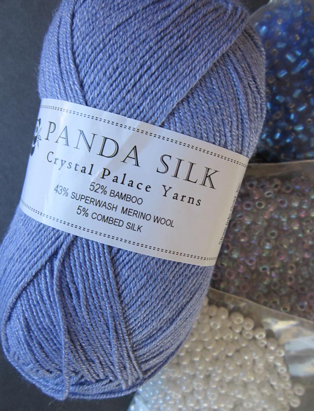
Results of a quick preference poll for choosing coordinating and contrast beads using Crystal Palace light periwinkle yarn color as an example.
Thanks for voting in the poll for your preference of bead color in this month’s prize drawing. The choices were
- a contrast in the same color family
- a coordinating tone-on-tone
- a contrast in a different color family
It is interesting to see initial reactions. It also helps me to get to know members’ interests better so I can bring the best experience I possibly can to the KnitHeartStrings site projects. Unfortunately, there were less than 10% response, so I am not sure if that means some couldn’t decide, or if didn’t care, or? Anyway, let’s surmise what we can from this —
I wanted to include some comments here from some of the members that can help you think about when choosing a bead color to go along with your yarn.
From Shirley: I really like the Amethyst Lined Crystal AB beads….I think the Sapphire are too great a contrast. The bag is gorgeous. I can hardly wait to start knitting it.
From Louis: I would go with the Amethyst Lined Crystal AB . Not only would this selection allow more of the yarn to “blend” with them, it would allow a great choice in “gifting”, particularly if you have a recipient in mind who is very “color sensitive”. The subtlety can lend elegance, allowing a bit of glitter without glitz.
From Elise: Silver-lined Sapphire – I love their rich depth.
From Diane: Amethyst lined crystal is what I like.
From jjmolvik: I like the darkest bead for a richer look all over.
From: Denise: I love the Silver-lined Sapphire the best. It is dark enough to contrast the yarn yet not enough to draw the eye away from the beauty of the yarn and pattern. Thanks so much! I really look forward to the Heart Strings email.
From Wanda: Wow! I like all three but since I have to pick I like the Silver-lined Sapphire. I like contrasting colors so they show up better. I have done very little with beads in knitting but what I have done I really like.
As you can see here for the poll results, there was a near neck-in-neck tie for the “contrast in same color family” and “coordinating tone-on-tone”. The “contrast in a different color family” fell way behind.
Actually, there is no right answer. A lot has to do with personal taste. But it can also be a bit anti-intuitive because other factors need to be considered in making a final choice; e.g.
1. transparency or opaqueness of the bead (will the yarn color running through the bead give an additive effect?)
2. the finish on the bead (will the bead reflect or mirror the color of the yarn, therefore giving additive or subtractive effects?)
3. planned density of the beads per fabric area (the color of an occasional bead embellishment will stand on its own, but a sea of beads will take over the color spectrum, and then there is the entire continuum between these 2 extremes)
Later this year, I plan to get into this some more. But if there are questions now, please post in the comments and I will make sure to cover them.
What kind of bead color person are you?

 HeartStrings FiberArts
 Knitting Bits of Lace on Facebook
 Ravelry Store
I’ve did beaded jewelry before I started adding beads to my knitting. I also do tatted lace with beads. I like to think I’ve learned a few things from my experiences. Up front, I’ll admit I avoid all color-lined beads that will be added to a project that might get wet as there is a risk of color transfer and bleeding, especially if a strongly contrasting color-lined bead is used. Metal-lined beads (silver, etc.) are fine, but one takes a chance with those red and purple linings. I know manufacturing processes have improved so perhaps things are better than they were 10 years ago, but I’m not risking it with a big project.
When choosing beads colors/finishes I want to be able to see the beads in the completed project. Knit a swatch with the beads and stand 6-10 feet away. Can you see the beads? If not, you might be wasting a lot of time, effort, and money to add beads to something that won’t be fully appreciated.
Yikes, edit! *I did*. Sorry folks 🙂